HIV: Geography of an Epidemic
French Emperor Napoleon Bonaparte is credited for saying that “A good sketch is better than a long speech”. Nowadays, the representation below of the HIV epidemic taken from the 2010 UNAIDS HIV epidemic update is a classic and illustrates both the extent of the epidemic worldwide and its concentration in some geographic areas. The choice of a particular shade of red to represent the percentage of those living with HIV highlights the plight of the African continent. The shade of red growing darker toward the southeast of the continent reminds us that it is home to 22.5 million of the 33.3 million infected with HIV worldwide, five and a half of them in South Africa alone.
In one single and rather simple picture South Africa (and Botswana) is most immediately recognisable as the country which bears the brunt of the epidemic. With that picture-triggered insight flows a stream of other pictures and mental associations about Africa, “hot and dusty with rolling grasslands and huge herds of animals and tall, thin people who are starving”, and South Africa plagued by apartheid, poverty, Noble prize president, AIDS denialist president, football world cup and slums, men raping women and other images too often prompted by mainstream media reporting than personal experience. Such is the power of a sketch.
But a few pages later, the UNAIDS report presents a slightly different picture of the epidemic in sub-Saharan Africa.
Using similar shade of red but a different scale to represent HIV prevalence, it is no longer South Africa that bears the brunt of the HIV epidemic but neighbouring Botswana (as well as Lesotho and Swaziland, harder to spot). Little is usually known about Botswana but for its history of diamonds mining and for being the set for Alexander McCall Smith’s novel, but by the power of representation, and a change of scale, Botswana is now the African country most affected by HIV: estimated rate of new HIV infection (incidence) and percentage of people living with HIV (prevalence) are respectively 1.56 & 24.8 in Botswana and 1.49 & 17.8 in South Africa. Actually the epidmic is even worse in Swaziland but the scale does not allow visualising this information.
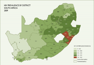
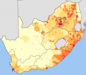
The problem is that a sketch, even good, can be deceitful. The next representations of the HIV epidemic at the province level illustrates that, as much as Africa is not a single country, the epidemic is not homogeneous within South Africa. The data used to generate the next pictures is derived from HIV testing in antenatal clinics. It represents a subset of the epidemic but considering that the South African epidemic disproportionately affects women and the difficulty of obtaining solid prevalence data for the general population, this data is a good proxy indicator. KwaZulu Natal is then identified as having one of the highest HIV prevalence at around 40% but looking at a scale lower than the province level also reveals that some districts in KwaZulu Natal are more affected than others. This should be looked at in relation to population density which in this case also illustrates that the epidemic is not at its highest in the most densely populated areas.
 |
 |
 |
Frank Tanser and colleagues from the Africa Centre for Health and Population Study went even deeper into the representation of the epidemic looking at the geographical patterns and clustering of HIV infections in a 438 km2 area part of the Hlabissa sub-district (one of the five sub-districts of the Umkhanyakude district) about 250 km north of Durban.
This mostly rural area contains a population of less than 90,000 Zulu-speaking people who live in scattered homesteads. There is only one township (KwaMsane) and a series of settlements along the national road that links Durban in the south to Mozambique in the North. It is in this area that the researchers have conducted HIV surveillance studies and have mapped the results spatially as shown on the next sketches.
Using advanced statistical analysis Tanser and colleagues identified clusters with a high number of HIV infection along the national road (Cluster 1, 2 and 3) but also clusters where HIV prevalence was very much lower (cluster 4, 5 and 6).
 |
 |
Remarkably, within a roughly 20 by 20 km area, HIV prevalence is not homogeneous with high HIV prevalence pockets next to pockets of low prevalence notwithstanding different population densities. Unsurprisingly, HIV prevalence is particularly high along the national road and in fact, the estimated density of people living with HIV is 15.7 times higher within 1 km of the road than it is in the rest of the area.
 There are several reasons that can explain this distribution such as differences in age distribution between clusters, mobility and labour-related migration, and prevalence of sex work, but not the usual culprits of poverty, lack of education or unemployment; indeed, the researchers reported that the area of high HIV prevalence were “characterised by higher aggregated levels of educations, household wealth and nearly double the rate of employment” but had lower level of marriage and proportion of migrants.
Representing the complexity of the HIV epidemic is challenging but the process reveals some important information. Generalisation can help focus our attention to particular geographic areas but should not blind us to the fact that the epidemic is neither global nor uniform in space and in time, a dimension that has not been discussed here. A representation of the HIV epidemic can have a huge impact on prevention strategy and programming, influencing where money is invested, and when one starts looking at the population behind blobs of colour on a map, many more questions arise, such as what services are most needed and for whom, what is the local human dynamic, the social strutures and power relationships, essential to understand for delivering successful interventions. Here we enter the field of anthropology rarely mentionned beyond generalities in HIV prevention. Graphical representation, and many will have noticed how the latest UNAIDS report uses an interesting arrays of new ways to represent available data, underlines but also challenges the use and value of global data and global strategy to devise local prevention programmes that may be difficult to implement or simply be irrelevant at the local level. Successful prevention programmes require awareness of the HIV epidemic globally, but also very locally.
rjt
Notes:The figure below illustrates the difference in HIV prevalence between men and women in Lesotho. Thanks to S. Collery for drawing attention to this work presented at the 18th Conference on Retroviruses and Opportunistic Infectionsin Boston in 2011. Construction of a Geospatial Health Policy Map for Lesotho Construction of a Geospatial Health Policy Map for LesothoM-H Go, B Coburn, J Okano, and Sally Blower* Ctr for Biomed Modeling, Univ of California, Los Angeles, US. |


These spatial representations are fascinating and every country has patterns of HIV transmission that make belief in the sexual transmission model rather challenging. Spatial representation of the epidemic in Lesotho showed that patterns for male and female prevalence were quite different; the hotspots for high male prevalence were in different parts of the country from hotspots for high female prevalence! I emailed the authors and was assured that HIV is definitely almost always transmitted sexually, they are just working on figuring out how this could be the case.
http://www.retroconference.org/2011/Abstracts/40065.htm
I’m waiting for the explanation with baited breath.
Simon